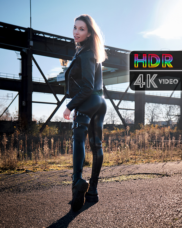
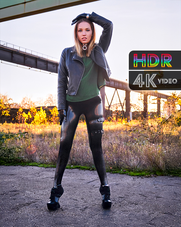
Redesigning a website is never just about new colors or fresh layouts. It’s about creating a structure that reflects how you want people to experience your work today, while preparing for the future. After months of fine-tuning, latexperiment has stepped into its next chapter with a design that is both darker and more refined; luxurious without screaming for attention.
The new look leans into deep green tones paired with beige typography. It’s understated, almost moody, and yet it radiates elegance. Think of it as a private gallery space: intimate, sophisticated, and carefully curated. That’s the mood I wanted to set, something that doesn’t compete with the visuals but frames them with quiet confidence.
A Cleaner Path Through the Work
The structure of the site has been stripped down to its essentials. Navigation is faster, more direct, with fewer dead ends and a clearer path through the albums. The mobile menu has been rebuilt so the most important links are always within a thumb’s reach—no digging through endless drop-downs.
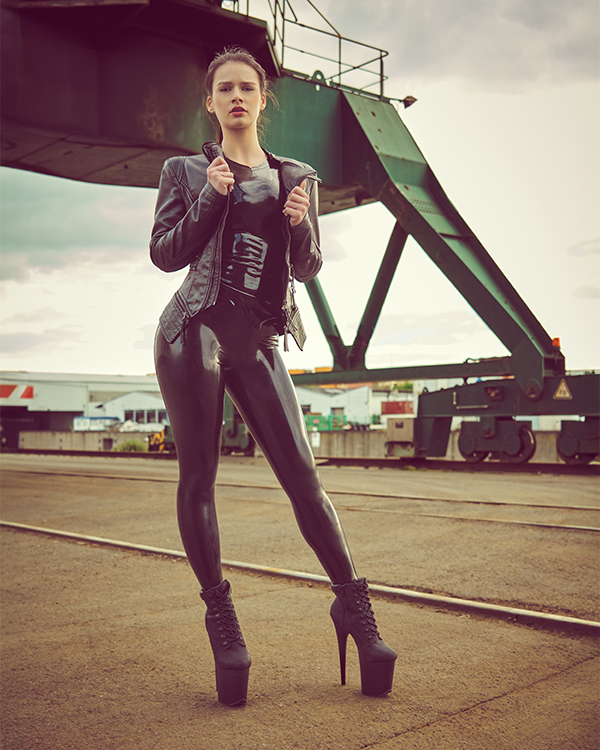
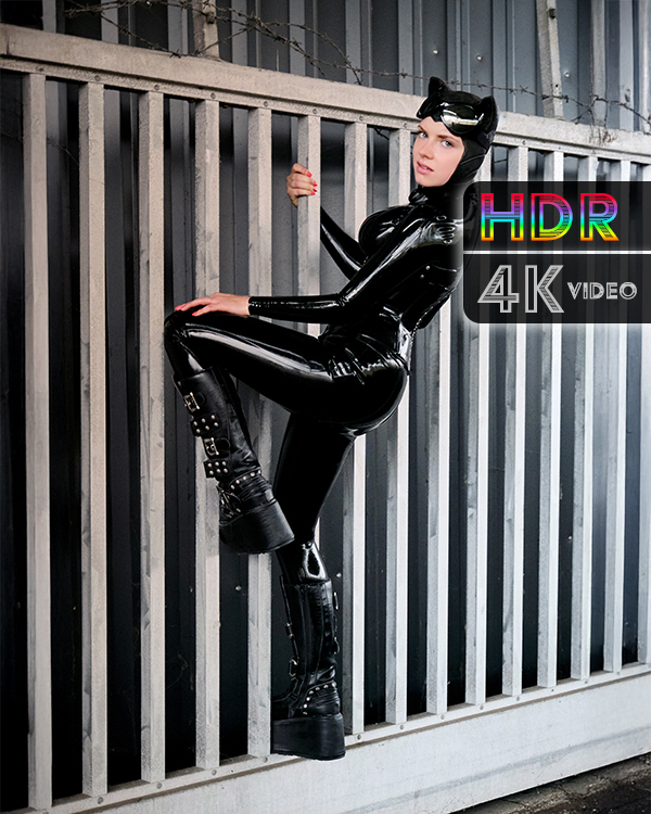
Every update now follows a simple, consistent flow: first text, then photos, then video(s), and finally the comment section. Beneath that, related albums appear so you can explore more from the same category. And if you just keep scrolling, the next update loads automatically. For Premium members, this means you can start with the latest album and simply move backwards in time without ever leaving the page. Clicking around becomes optional; the experience is seamless.
Built for Flow, Not Friction
The redesign isn’t just about aesthetics, it’s about removing friction. I wanted the experience to feel natural, like flipping through an endless magazine where every page flows into the next. No interruptions, no unnecessary detours, just a direct connection to the content.
That flow is what makes latexperiment feel alive again. The site doesn’t just host the work; it becomes part of the work. Each transition, each scroll, is part of the rhythm.
What Comes Next
This redesign isn’t the final word, it’s the foundation for what’s coming. A platform where photography, video, and community are tied together in a way that feels modern but grounded. A space where updates aren’t just consumed but experienced.
I’m still building, still pushing, still refining. But this new version of latexperiment is already a significant step forward. A clearer structure, a bolder design, and an experience built for flow. That’s what the future deserves.
P.S. The re-upload of all albums is going pretty well. Of course it needs time but rest assured it’s all coming back, sometimes even re-edited for a higher quality.